The Inner Light by Otto Berkeley
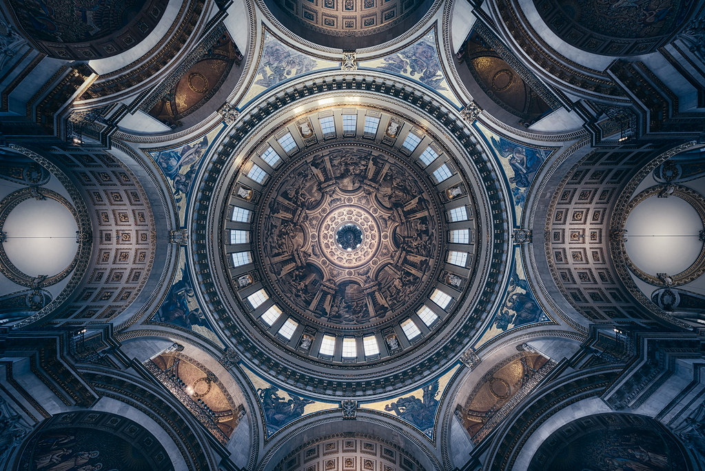
During the most recent photography evening at St Paul's Cathedral, I took the opportunity to reshoot a look-up of its magnificent central dome. Just standing beneath the 225ft-high dome and taking in the sheer magnitude of Sir Christopher Wren's accomplishment is a joy, but I wanted a second attempt at an image that I last captured three years ago, and I wanted to try to convey something not only sharper and cleaner but also darker and moodier. I was fortunate enough to be shooting with clear skies that evening, and as the sun was setting there was vivid golden light streaming through the windows and striking the eastern side of the cupola, reflecting light along the inside of the dome and creating a subtle contrast along the building's surfaces. Although I already had an idea of the colder tone I wanted when editing the inside of the cathedral, I liked the drama of the warm light at the centre of the frame and the way the golden tones illuminated Sir James Thornhill's painted decoration at the top of the dome. The final image is a combination of eight bracketed exposures -- captured with the camera lying flat on the ground and the shutter triggered by remote -- which were then blended using luminosity masks in Photoshop. Although the sun hadn't yet set, bright spotlights from the upper gallery were switched on, and these contrasted significantly with the dark shadows around the tapestries surrounding the dome, so the challenge when blending the exposures was to bring out the hidden decorative detail while reining in the intensity of the spotlights as well as the sunlight coming through the window. In the end, I isolated portions of the corresponding balcony on the other side of the dome and used these to mask out the spotlights, as I didn't think they added anything to the scene and had the potential to be a distraction. At the colour-grading stage, I used a mixture of Curves, Levels, Colour Balance and Gradient Map adjustments to emphasise the blue tones in the shadows and the reddish-yellows in the midtones and highlights, as well as a Selective Colour adjustment to add a hint of cyan into the blue and some magenta into the yellow. At this stage I also used my brightest exposures and a selection of gradient masks to emphasise the tonality of the dome and the surrounding arches, brightening portions of the image in order to hopefully convey a sense of the depth in the image. This was important to me because, although the look-up has a kaleidoscopic and quite abstract aspect to it, I wanted viewers to have some sense of the scene's scale and proportion. My aim with the edit was a low-contrast finish in the shadows, so when increasing structure and amplifying the whites in Nik's Silver Efex Pro, I targeted these adjustments to the highlights and midtones, creating a sense of contrast but avoiding a finish that would seem too harsh. Finally, inside Colour Efex Pro, I used the Low Key and Darken/Lighten Centre filters to gently darken the edges of the frame, hopefully drawing the eye to the cupola at the centre of the image and the awe-inspiring artistry of the images and patterns surrounding it. You can also connect with me on Instagram, Facebook, 500px and Google+. https://flic.kr/p/25wNvNF


댓글
댓글 쓰기