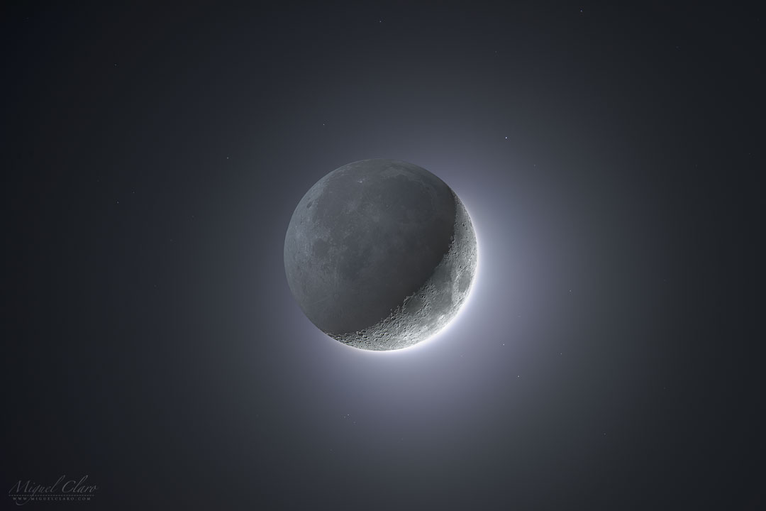
How come the crescent Moon doesn't look like this? For one reason, because your eyes can't simultaneously discern bright and dark regions like this. Called earthshine or the da Vinci glow, the unlit part of a crescent Moon is visible but usually hard to see because it is much dimmer than the sunlit arc. In our digital age, however, the differences in brightness can be artificially reduced. The featured image is actually a digital composite of 15 short exposures of the bright crescent, and 14 longer exposures of the dim remainder. The origin of the da Vinci glow, as explained by Leonardo da Vinci about 510 years ago, is sunlight reflected first by the Earth to the Moon, and then back from the Moon to the Earth. via NASA https://ift.tt/3glE0dZ
iOS 아이폰용 앱 개발을 위한 디자인시, 디자이너가 참고 해볼만한 사항들
스크랩 - http://blog.naver.com/PostView.nhn?blogId=vowed&logNo=220525263909&redirect=Dlog&widgetTypeCall=true 저는 안드로이드와 아이폰 둘다 개발을 합니다. 안드로이드앱의 개발은 UI요소 개발이 비교적 자유료운 반면, 아이폰 개발은 디자인과 관련되서, 제한이라던지, 커스텀의 어려움이라던지 하는, 고려해야할 사항들이 좀 있습니다. 지인의 부탁으로 인해, 아이폰 개발과 관련되서, 앱 디자인시 유념해둬야 할 부분을 적어둡니다. 서두 ----- (대충보고 모두 이해하지 못하셔도 무방합니다) 안드로이드는, 처음부터 수많은 기기, 수많은 해상도에 알맞게 표현하기 위해 LinearLayout, RelativeLayout, TableLayout 등등, 레이아웃을 자동으로 잡기에 알맞게 되어있습니다. 게다가 "WrapContent"라는 옵션이 있어서, 컨텐츠의 크기에 알맞게 자동으로 자신의 뷰 크기를 결정해주는것이 아주 편리합니다. 반면, 아이폰은 단일기기, 단일 해상도만 개발해주면 되었던, 태생적 특징 때문에 "X, Y" 절대좌표를 가지고 개발을 했었습니다. 후에 "AutoLayout"이라는 개념(안드로이드의 RelativeLayout과 비슷) 이 도입되긴 합니다만, 여러 디자인 요소들사이의 상관관계를 계산하고 결국 X,Y 절대좌표를 가져버리는 특징이 있습니다. 그래서 안드로이드는 여러가지 상황에 따라 자동으로 레이아웃의 좌표, 크기등을 가변적으로 자연스럽게 표현해주기 매우 편리하지만, 아이폰은 그렇지 않습니다. 가변적인 상황이 불가능하지는 않습니다만, 귀찮은 코딩을 해줘야만 하지요. 그래서 가급적이면 아이폰 개발에 관련된 디자인을 할 때에는, 뷰 (혹은 레이아웃)의 크기를 컨텐츠의 크기에 의존적으로 가변적이...
댓글
댓글 쓰기