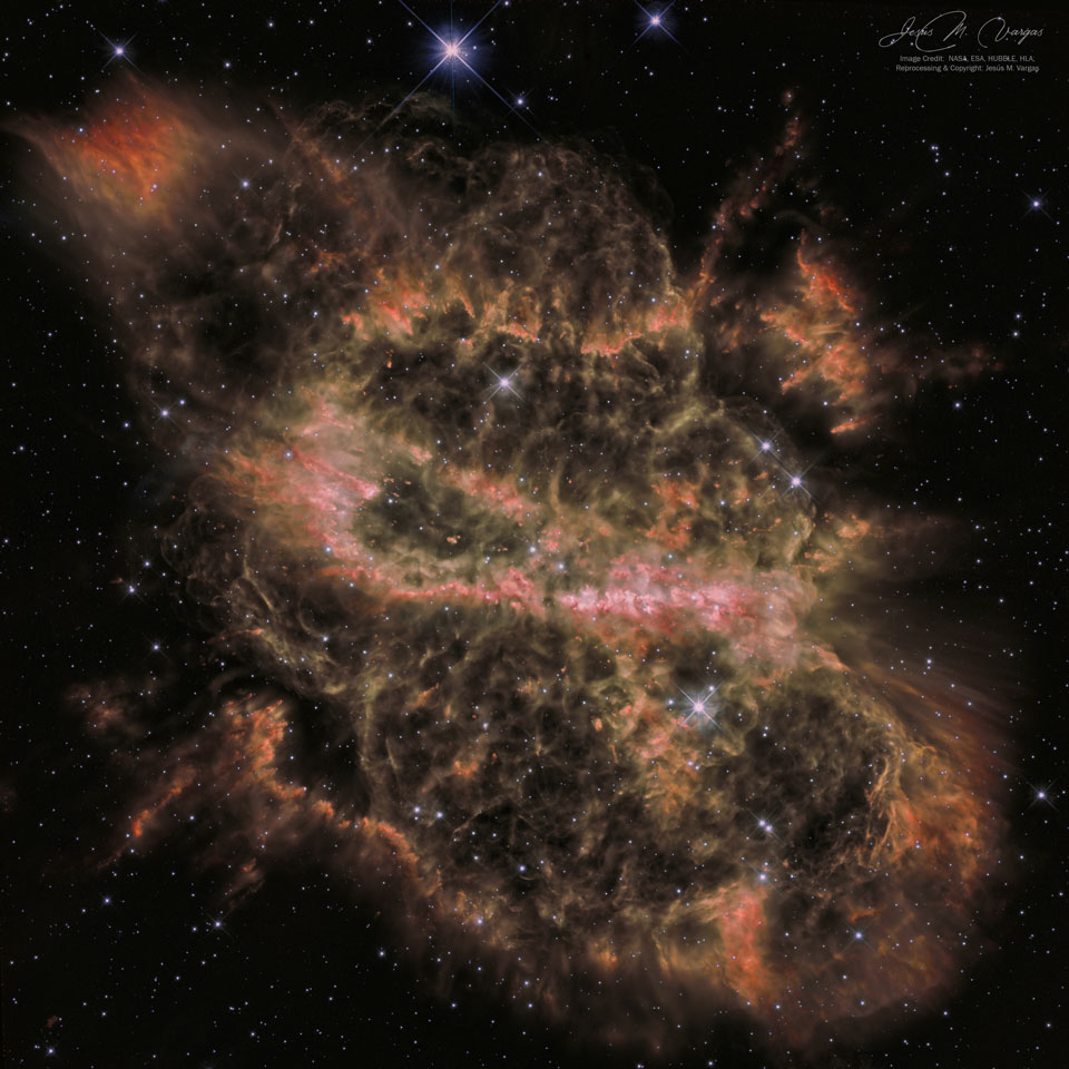
Why is this nebula so complex? When a star like our Sun is dying, it will cast off its outer layers, usually into a simple overall shape. Sometimes this shape is a sphere, sometimes a double lobe, and sometimes a ring or a helix. In the case of planetary nebula NGC 5189, however, besides an overall "Z" shape (the featured image is flipped horizontally and so appears as an "S"), no such simple structure has emerged. To help find out why, the Earth-orbiting Hubble Space Telescope has observed NGC 5189 in great detail. Previous findings indicated the existence of multiple epochs of material outflow, including a recent one that created a bright but distorted torus running horizontally across image center. Hubble results appear consistent with a hypothesis that the dying star is part of a binary star system with a precessing symmetry axis. NGC 5189 spans about three light years and lies about 3,000 light years away toward the southern constellation of the Fly (Musca). via NASA https://ift.tt/324JHrZ
댓글
댓글 쓰기